Role
UX Research
UX/UI Design
Timeline
May 2024
4 weeks
Tools
Figma
Figjam
Google Suite
Introduction
Trading Card Games (TCGs) are strategic card games, utilizing deck-building and trading card elements. Popular TCGs include: Pokemon, Yu-Gi-Oh, and Magic: The Gathering.
Bandai TCG+ manages event registration at the local, regional, and national level for Bandai’s TCGs, such as One Piece and Dragon Ball. It also supports searching for card stores, keeps track of event rankings, and allows for deck-building.
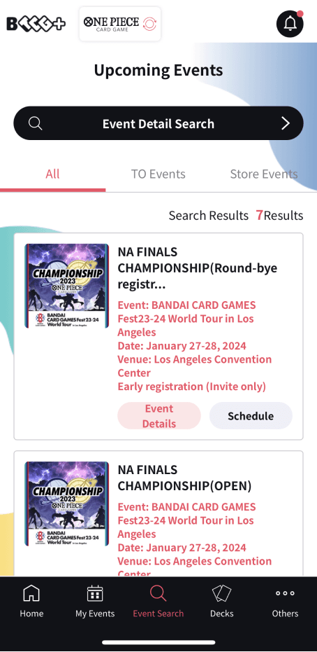
As a frequent player of the One Piece Card Game (OPTCG), I regularly use Bandai TCG+ to register for local events. My personal experience with the app has been frustrating, and my peers share similar sentiments. The current event sign-up screen, shown below, is cluttered, confusing, and overly text-heavy. Additionally, the app has a low average rating of 1.4 out of 5 stars on the App Store. This redesign aims to create a more intuitive and streamlined experience for users.

Research
User Interviews
Although I have my own opinions about the app, they may not reflect the broader user experience. To gain a more comprehensive understanding, I conducted interviews with five OPTCG players to explore their motivations, preferences, and challenges when using Bandai TCG+.
Insights
These two quotes from my user interviews highlight the core issue users face with the app.

“ If someone didn’t walk me through it the first time, I would still have no idea how to apply to locals, and that’s a big part of my life. ”

“ There are a lot of hoops to jump through. ”
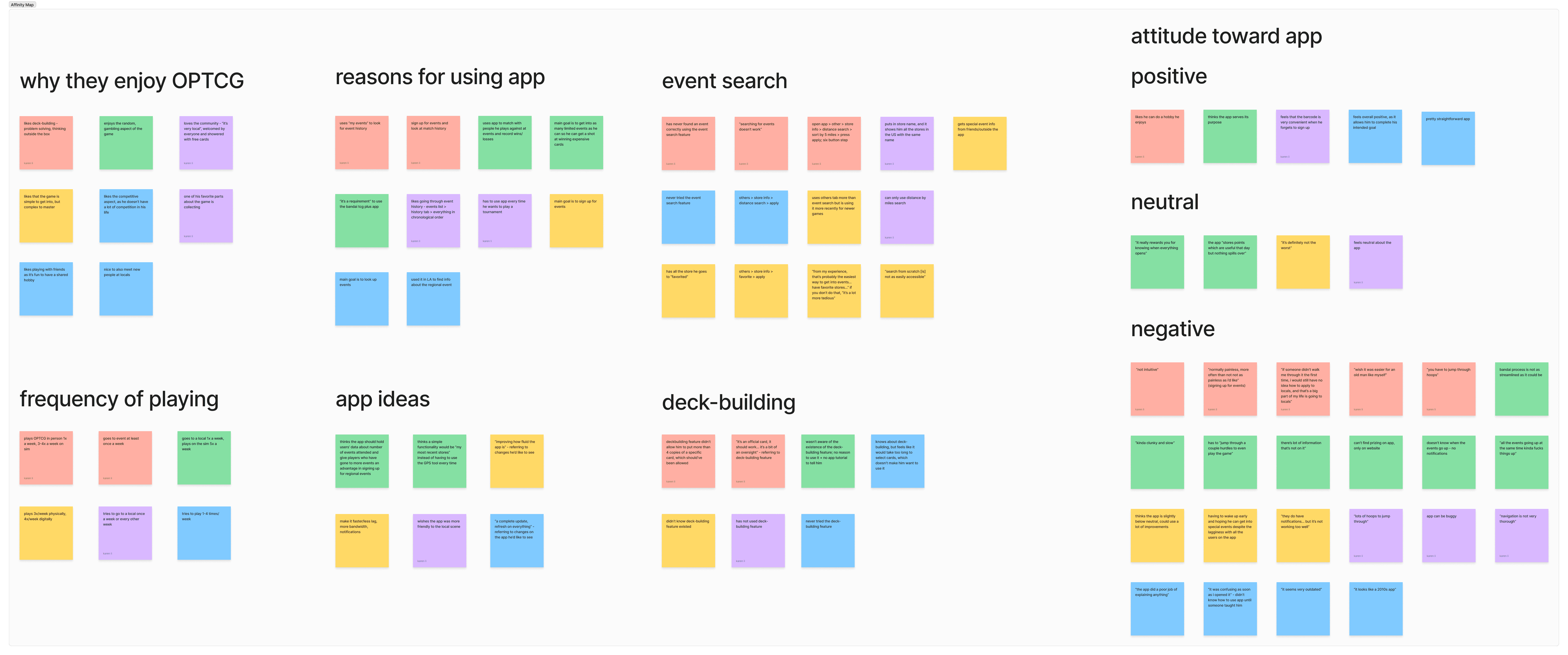
Here are the main takeaways from my affinity map analysis:
The primary use of the app for users is to sign up for events.
Users find the app difficult to navigate and describe it as outdated, confusing, and lacking key information.
Users are frustrated with the excessive notifications and inability to easily clear them.
Most users are either unaware of or do not use the deck-building feature.
Redesign Focus
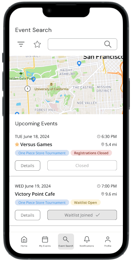
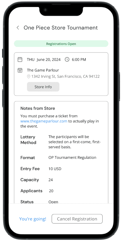
With these research findings in mind, I identified the primary focus of this redesign as improving the event search feature, the most critical user task. OPTCG players rely on the app to sign up for local and national tournaments, yet this feature is unnecessarily difficult to navigate. Additionally, users expressed frustration with the lack of context for store locations, despite being provided distance in miles and store addresses. To address this, I incorporated a map feature, allowing users to visually locate stores in relation to themselves.
The secondary focus involves replacing the underused deck-building menu item with an expanded notifications systems, addressing user frustrations and enhancing usability in a more relevant area.
Current Task Flow
The current task flow requires multiple steps just to find and apply to an event. If filters are applied incorrectly, users must restart the entire process, often without knowing which filter was the problem, as there is no feedback provided. There are no format requirements, error checks, or error messages. This can lead to repeated attempts with no results, creating an extremely frustrating experience.

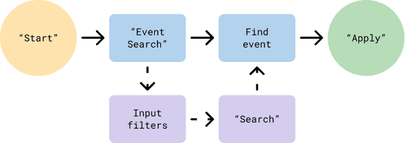
Proposed Task Flow
The proposed task flow simplifies the event-finding process by allowing users to search for events without the need to apply filters. However, filter options are still available for those who want to narrow their search by distance, date, or favorite stores.
User Persona
I developed a user persona by synthesizing insights from the user interviews I conducted, as well as interacting with actual players at local OPTCG tournaments.

Design
Sketches
Here are some initial sketches for the redesigned event search feature flow.


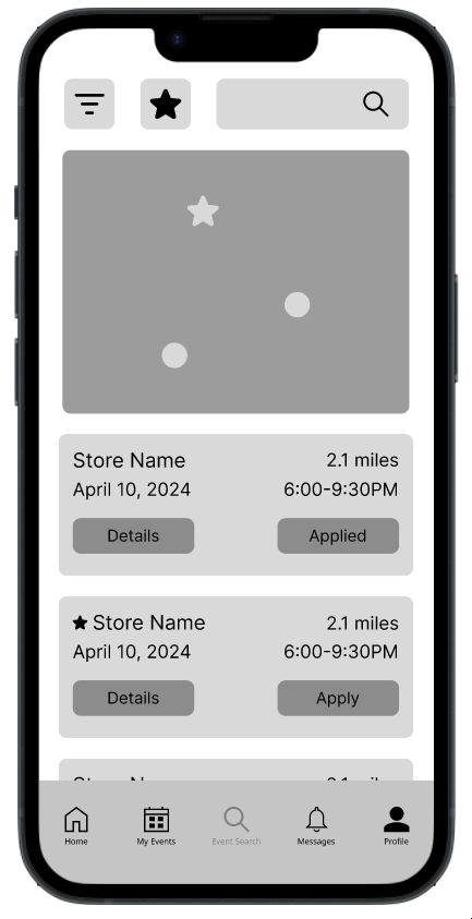
Mid-fidelity Prototype
After the initial sketches and some more brainstorming, I created a mid-fidelity prototype.

Searching for events by distance
Turning on store notifications
Usability Testing
In order to validate my design decisions, I conducted 8 usability tests — 5 with OPTCG players familiar with the app and 3 with non-users. The usability test focused on 4 tasks, each related to different aspects of the event sign-up feature that was redesigned. Here are the key results:
5/8 participants successfully completed Task 1.
8/8 participants successfully completed Tasks 2, 3, and 4 .
3/5 of the current users noted that they liked that there were less clicks involved in the prototype than on the actual app.
Solution
High Fidelity Prototype 2.0
With my design choices validated, I developed the high fidelity prototype. The current user interface of Bandai TCG+ has been described as outdated, confusing, overwhelming, and inconsistent. To address these issues, I designed a more modern and minimalistic user interface. Although I didn’t establish a formal design system, I utilized consistent text and color styles throughout the project to create a cohesive visual identity.

Turning on store notifications

Applying to an event using the favorites button

Clearing unread notifications